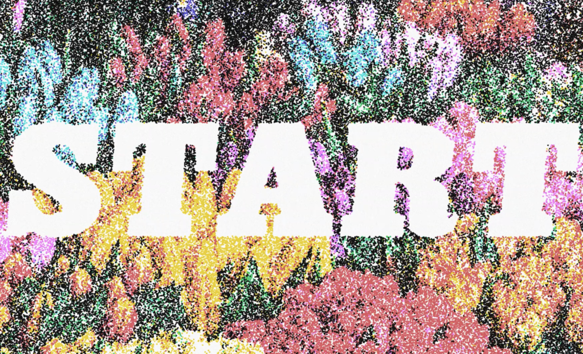
Stipple shading is a classic technique used in traditional ink illustrations and vintage prints to create depth and texture using tiny dots. In this Photoshop tutorial, we’ll walk through a non-destructive, fully adjustable stipple shading effect that doesn’t require brushes. Instead, we’ll use filters, smart objects, and blending modes to create a high-quality stippling effect that can be easily customized.
By the end of this guide, you’ll be able to apply this effect to any image, text, or design with full control over dot size, density, and color variations. Let’s dive in!
Step 1: Setting Up the Composition
Before we start building the stipple effect, we need to prepare our workspace.
1. Create a New Photoshop Document
- Open Photoshop and create a new document.
- Use a canvas size of 3840×2160 pixels (or any size close to 4K resolution).
- Set the color mode to RGB, 16-bit for better gradients and color adjustments.
- Keep the background white for now.
2. Add a High-Contrast Image
- Drag in a black-and-white image or illustration.
- If your image is in color, go to Image > Adjustments > Desaturate (Shift + Ctrl/Cmd + U).
- Ensure the image has a strong balance of dark and light areas for the best stippling results.
Step 2: Convert the Image to a Smart Object
Working non-destructively is key to flexibility.
- Select all the layers (Shift + Click to highlight multiple layers).
- Right-click on the selection and choose Convert to Smart Object.
- Now, any filters and adjustments applied will be fully editable.
Step 3: Applying Initial Image Adjustments
Now, let’s prepare the image for stippling by adding some adjustments and filters.
1. Adjust Hue/Saturation
- Go to Image > Adjustments > Hue/Saturation.
- Drag the Saturation slider all the way down (-100) to make the image grayscale.
- Optional: Keep this layer turned off for later color experimentation.
2. Add a Soft Blur to Scatter the Stipples
- Go to Filter > Blur > Gaussian Blur.
- Set Radius to 2 pixels.
- This will help scatter the stipple dots naturally.
3. Adjust Levels for Better Contrast
- Go to Image > Adjustments > Levels.
- Adjust the midpoint slider to brighten mid-tones.
- This will enhance the balance between light and dark areas.
Step 4: Creating the Stipple Effect
1. Apply a Second Levels Adjustment for Dot Control
- Go to Image > Adjustments > Levels again.
- Set the black output level to ~240 (or even higher at 242).
- This lightens the image, ensuring the stipple dots aren’t too dense.
2. Add Noise to Generate the Stipple Pattern
- Go to Filter > Noise > Add Noise.
- Set Amount: 100%.
- Choose Uniform and Monochromatic.
- Click OK.
3. Convert Noise to Stipple Dots
- Go to Filter > Other > Minimum.
- Set Preserve: Roundness.
- Adjust Radius: 4 pixels.
Now, the noise pixels are converted into clean, circular dots.
Step 5: Refining the Stipple Texture
To break the digital perfection and add an organic look, let’s introduce subtle distortions and texture.
1. Slightly Blur the Stipples for Natural Variation
- Go to Filter > Blur > Gaussian Blur.
- Set Radius: 1 pixel.
- Reduce the opacity of this effect to 70% (Double-click the blending options slider on the layer).
2. Add Paper-Like Texture to Dots
- Go to Filter > Noise > Add Noise.
- Set Amount: 40%.
- Change noise type to Gaussian.
- Set blending mode to Screen at 50% opacity.
3. Add an Extra Layer of Noise for Paper Texture
- Apply Add Noise again, but this time set blending mode to Multiply at 10% opacity.
- This adds grain to the background areas for a more authentic print look.
4. Slightly Distort Dots for Hand-Drawn Effect
- Go to Filter > Distort > Ripple.
- Set Amount: 30%.
- Set Size: Large.
Now, the dots are less uniform and have a hand-inked appearance.
Step 6: Adjusting Sharpness and Details
1. Apply an Unsharp Mask to Enhance the Stipples
- Go to Filter > Sharpen > Unsharp Mask.
- Set Amount: 50%.
- Set Radius: 1 pixel.
- This brings out the details in the stipple pattern.
2. Fine-Tune the Dot Density
- Adjust the Levels output values to control how many dots appear.
- Lower black output levels for more dots.
- Increase black output levels for fewer dots.
Step 7: Adding Color Variations (Optional)
One of the coolest parts of this method is the ability to colorize the stipple dots individually.
1. Open Hue/Saturation Adjustment
- Go to Image > Adjustments > Hue/Saturation.
- Click Colorize.
- Adjust Hue, Saturation, and Lightness to create a monochrome stipple look.
2. Adjust Individual Colors for a Multicolor Effect
- Since the dots are pure red, yellow, green, cyan, blue, and magenta, you can target each color.
- Go to the dropdown under Hue/Saturation and select a specific color range.
- Adjust the brightness or hue of just that color.
- Example: Convert yellows to bone color, or make reds darker for a sepia effect.
Now you can reduce the color palette to just two or three colors for a true vintage feel.
Step 8: Making the Effect Fully Reusable
The beauty of this smart object workflow is that you can replace the source image anytime.
- Double-click the Smart Object Layer.
- Replace the existing image with a new image, text, or shape.
- Save and close the smart object.
- Your stipple effect updates automatically!
Conclusion
That’s it! You’ve successfully created a highly flexible, customizable stipple shading effect in Photoshop without brushes. Unlike traditional hand-drawn stippling, this technique allows for rapid experimentation, precise adjustments, and easy color customizations.