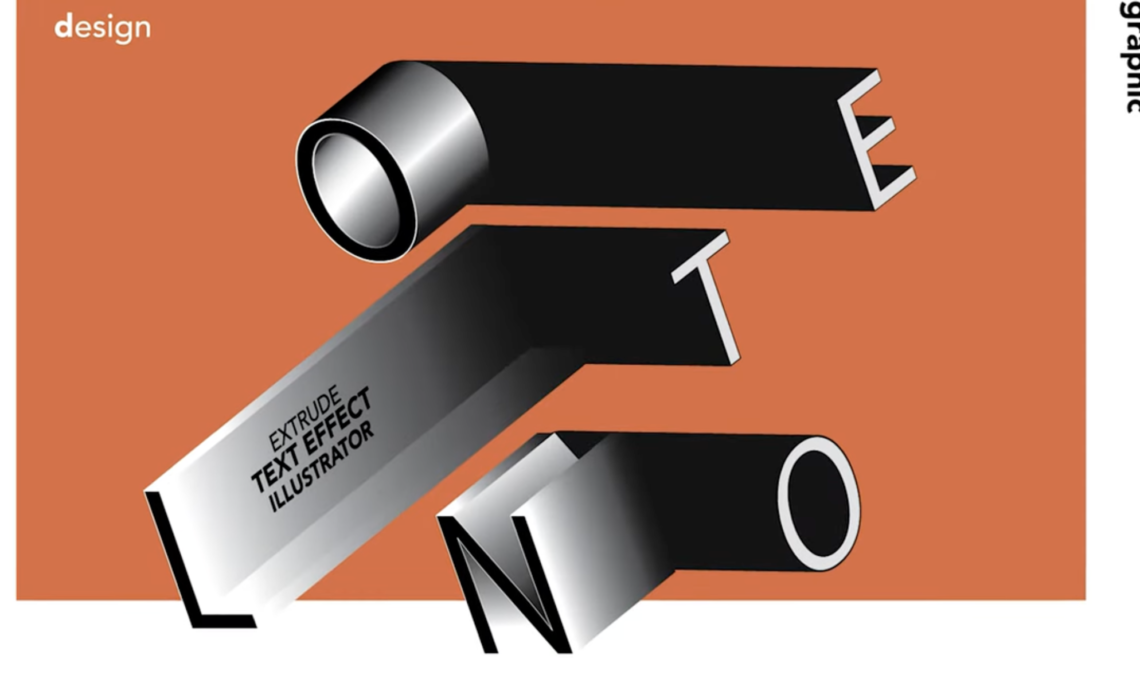
Creating extruded text effects in Adobe Illustrator can add depth and dimension to your designs. In this tutorial, we will explore three different extrude text effects:
- Vertical Extrusion with Gradient Colors
- Perspective Extrusion with Black Sides
- Blended Extrusion with Lighting Effects
By following these steps, you’ll learn how to use Illustrator’s 3D and Material effects, apply gradients, and customize your text for stunning results. Let’s dive in!
Design 1: Vertical Extrusion with Gradient Colors
Step 1: Type and Customize the Text
- Open Adobe Illustrator and create a new document with your preferred dimensions.
- Select the Type Tool (T) and type out your text, choosing a bold font for better visibility.
- Customize the text size and font according to your preference.
- Copy the text by holding Alt (Windows) / Option (Mac), clicking, and dragging to create duplicates.
- Select the text and go to Object > Expand, ensuring both “Object” and “Fill” are checked to convert the text into shapes.
- Use the Direct Selection Tool (A) to adjust the anchor points and modify the shape of the text for a unique look.
Step 2: Apply Extrusion Effect
- Select your text and go to Effect > 3D and Materials > Extrude & Bevel (Classic).
- Choose Isometric Top as the angle setting.
- Adjust the Extrusion Depth to achieve the desired thickness.
- Click OK to apply the effect.
Step 3: Apply Gradient Colors
- Expand the appearance by selecting the text and going to Object > Expand Appearance.
- Ungroup the objects multiple times (Right-click > Ungroup) until each face is separated.
- Use the Eyedropper Tool (I) to pick and apply gradient colors to different text faces.
- Adjust the gradient direction using the Gradient Tool (G) for smooth color transitions.
- Modify the gradient stops by selecting RGB mode and inputting the exact color codes for a professional finish.
💡 Tip: Experiment with different gradient combinations to find the best color harmony for your design.
Design 2: Perspective Extrusion with Black Sides
Step 1: Type and Apply Stroke
- Use the Type Tool (T) to type your text.
- Change the fill color to black and add a white stroke.
- Reduce the stroke thickness to 0.25 pt for a subtle outline.
Step 2: Apply Perspective Extrusion
- Select the text and go to Effect > 3D and Materials > Extrude & Bevel (Classic).
- Choose Isometric Left and increase the Extrusion Depth slightly.
- Create a duplicate of the text by pressing Alt/Option + Drag.
- Select the duplicate text and change the extrusion angle to Isometric Right.
Step 3: Adjust Position and Colors
- Adjust the duplicate text position to align with the original.
- Change the fill color of the extrusion parts to white and the stroke to black.
- Increase the stroke thickness slightly to make the design stand out.
- Fine-tune the placement by adjusting the layer order under Object > Arrange > Bring to Front.
💡 Tip: If the extrusion edges appear jagged, increase the document resolution or use the anti-aliasing settings under Preferences.
Design 3: Blended Extrusion with Lighting Effects
Step 1: Type and Customize Text Shape
- Type the desired number or letter and adjust the size.
- Choose a curvy font for a more dynamic effect.
- Expand the text using Object > Expand.
- Use the Pen Tool (P) to draw a curve and divide the text into sections using the Pathfinder > Divide option.
- Adjust anchor points with the Direct Selection Tool (A) to refine the curve.
- Change the fill to stroke with a thickness of 0.5 pt to make the outline more visible.
Step 2: Apply Blending Mode
- Use the Scissors Tool (C) to cut sections for blending.
- Apply the Blend Tool (W) to create smooth transitions between the curves.
- Adjust blending steps to enhance the effect for a smooth gradient-like transition.
- Modify Stroke Weight under the Stroke Panel to fine-tune the look.
Step 3: Apply Advanced Extrusion and Lighting
- Group the blended shapes and go to Effect > 3D and Materials > Extrude & Bevel.
- Choose Isometric Top and adjust the Depth.
- Open the Lighting Panel under Materials and fine-tune:
- Reduce Intensity for softer shadows.
- Adjust Softness for a more realistic look.
- Modify Light Angle and Height for depth.
- Activate Ray Tracing Render for high-quality shading.
💡 Tip: For a glowing effect, duplicate the text, blur the background layer, and set the blend mode to Overlay.
Final Adjustments and Exporting
- Group all elements (Ctrl+G / Cmd+G) for easier manipulation.
- Rotate the text slightly for a more dynamic effect.
- If needed, create a clipping mask to trim excess parts.
- Export the final design by going to File > Export > Export As and choosing PNG, JPG, or SVG.
- Optimize for web by selecting Save for Web (Legacy) under File for a compressed version.
💡 Tip: Always save a working file in AI format before final export in case future edits are needed.
Conclusion
By following this tutorial, you have learned how to create three different extruded text effects in Adobe Illustrator. Each technique enhances typography with depth, gradients, and lighting for professional-quality designs.
Key Takeaways:
- Design 1 focused on gradient application and isometric extrusion.
- Design 2 emphasized perspective adjustments with contrasting colors.
- Design 3 introduced blending techniques with realistic lighting effects.
For more Illustrator tutorials, check out our playlist and subscribe for future updates! If you found this guide helpful, don’t forget to like and share.